
Mixed Media Paintings

Hi there,
This month (1/2025) has me embarking on a mixed media course through Empire State College. What’s the first thing that comes to mind when you see or hear the words “mixed media”? For me, it’s collaging; assembling found images and paper and poetry and stitching it all together with glue. When I recently surfed the wild world wide web for more examples of mixed media art, my little mind was blown. There is some absolutely astounding art out there created by any means necessary-found objects and materials, intermixing paint and ink and medium applications, MOD PODGE ( I’m capitalizing every letter here because Mod Podge is a vibe), etc. etc. There are so many vehicles out there to get you to your creative goal or endeavor. My goals for this course are: to challenge myself to bring elements of collage into a painting or drawing while making it look like both were created by the same hand, explore composition, experiment with masking techniques and layering, further explore color theory and materials and mediums I’ve never worked with before. Finally, with no pressure to myself here, I’d like to create impactful work.
As a paint on canvas/paper gal, the most I’ve ever explored is with what I’m painting on. I’ve also painted on glass windows, fabric and wood. I’ve dabbled with spray paint and created my own stencils. But this Mixed Media course so far has me driving in all the medium vehicles. When I mention the internet being wild, I am not exaggerating. Not meaning to sound like an elder millennial, it’s definitely a different place than it was even 10 years ago. EVERYTHING is oversaturated with content. There are millions of ways (and opinions) on how to plant your seedlings and a thousand techniques and mediums to transfer a photo or magazine image onto a surface. Lots of conflicting information too. Testing all these mediums has me executing the scientific method.
This first project of the semester, which I’m titling: Mixed Media _Project One (maybe I’ll change that later), took me a solid week to test all the gels, glosses, mediums, gesso, Mod Podge, and tools. Once I was happy with the test results, I turned to my substrate of choice: canvas (surprise!) I also learned a new word: substrate. Basically what you’re applying a material to. Please see my progress and notes below.
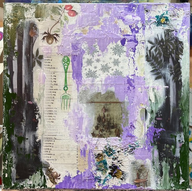
Mixed Media Project #1
Materials used: gallery wrapped canvas, magazine and book clippings, tissue paper, ink, acrylic paint, matte gel medium, Mod Podge, acrylic semi-gloss medium, paint markers and gloss gel medium.
Apply collage with gel medium. I found that there was no difference with how the clippings adhered to the canvas with the matte gel medium and the semi-gloss or gloss mediums and Mod Podge. I did discover though, that for transferring an image to overlap on another or the canvas, using a gel medium vs. Mod Podge worked better for me. An example of a transferred image in this first step is in the upper left corner; the red berries and the music notes in the bottom left.

First Steps:
Note about collage clippings: these were found in magazines that had a good paper and ink quality. In my research I discovered transferring images with a gel medium didn’t work as well with inkjet printed images as it did with laser printed. Higher quality magazines use laser print, which are unfortunately more expensive. I purchased two magazines for this project and also created the ink splatters on the tissue paper and cut out the vitamin gram info from a nutritional book.
I chose these images/clippings because they all seemed to begin to tell a story. They were also starting to change the narrative of what I intended my focal point/main subject to be.
Second Steps:
Unify edges of collage and create color blocks. To make the images seem more cohesive with one another, I applied gesso around their edges and then used a palette knife to apply the paint “impasto.” This not only covered up any seams from the clippings but also creates some juicy texture.
I choose the different hues of green and purple because they are analogous and usually create harmony on a surface together. The clippings were also dominant in green hues, so I wanted to have the paint start to blend with certain images.

Third Steps:
Build upon layers using different mediums and applications. Here you can see the introduction of purple and gold ink, gold paint marker, text and a charcoal sketch of the hind leg of a wolf.
The text in the upper left corner and between the trees on both sides was adhered using a packing tape transfer method. I put packing tape (and the kind of tape matters!) over the text in a magazine, cut the text and tape out and soaked in a pan of warm water. Several minutes later I used a sponge to gently peel off the magazine paper backing, which left just the black text. Then I trimmed the tape back slightly and used a gel medium to apply it to the canvas. I used a gel matte medium over the tape to take the shine away and seal it. In this step I also used the purple ink to take the light red hue out of the berries. I didn’t want it to be the only part of red in the painting and subsequently draw away from anything.
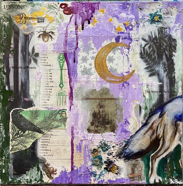
Lessons, 12” x 12”, mixed media
Final Steps:
Add touches of paint or additional applications but know when to walk away. I could have easily kept adding elements or paint or ink but too much is never a good thing. The story was told here.
The overall painting seemed off balance after I painted the wolf, so I added the crow and sparrow in the left corner. This crow and sparrow clipping was taken from a lovely birthday card my husband gave me a few years ago. The final thing I “glued” to the painting was a piece of tissue paper that I dropped gold ink on and used my signature skeleton key ink print on.
The sides were a fleeting last thought. If it’s gallery wrapped canvas, I always paint my sides. I used two different methods to apply the images: gel medium as a glue and sealer for the magazine clippings and transferring a design on the canvas using semi-gloss gel.


Goals for the next project:
-Troubleshoot Mod Podge photo transfers
-Space out background images and work on larger substrate that is not canvas
-Research other image and text transfer techniques
I had a rough sketch planned for the original painting/subject but once I assembled the collage of images and made color blocks, the subject matter changed. The background seemed to indicate the focus and theme of the foreground. For the next project, I would like to stick to the original plan in my sketchbook. This may also help with avoiding making a painting too busy. But I should also leave room for spontaneity because that is where the joy and Zen comes from.
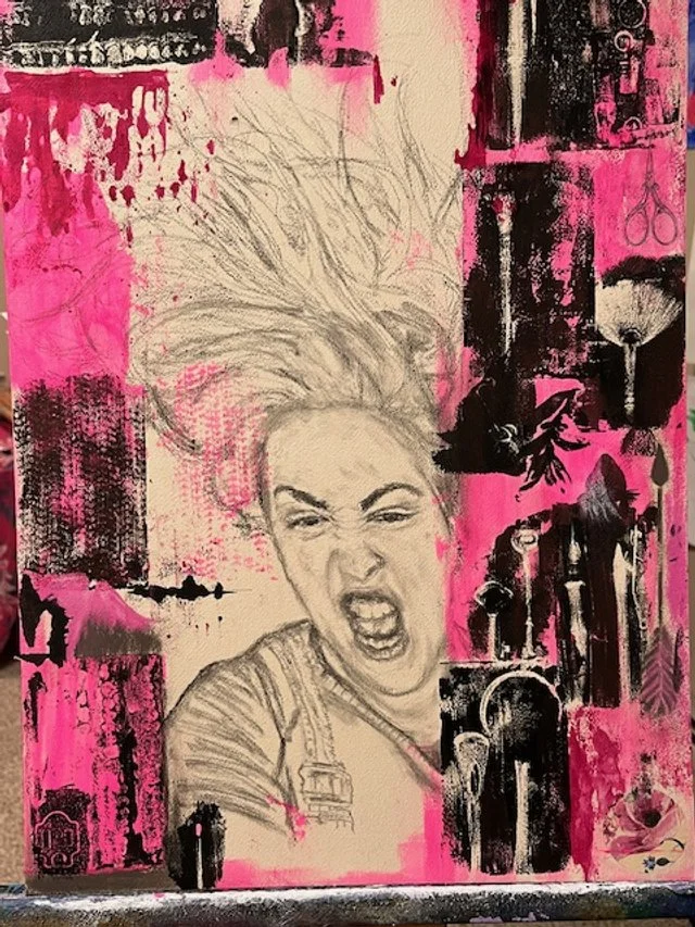
Materials used: cold pressed paper on board, 3” x 5” gelli plate, found objects, stencils, transfers, pastel chalk, ink, acrylic paint, charcoal pencils
Mixed Media Project #2
FIRST STEPS:
Experiment with the gelli plate. What worked for image transfers? Acrylic paint! What didn’t work? Ink!
I used a palette knife to spread a thin layer of black acrylic paint on top of the gelli plate. I then pressed one of my paint brushes onto the surface to create an impression. I immediately pressed the gelli plate to my substrate. Timing is a factor because of how quickly acrylic paint dries.
Once I discovered that impressions transfer with the acrylic paint, I was excited to see which objects made the best ones. The paint brush is beautiful with the details in the bristles but I was most excited about the impression from a mold of my top teeth that I had kept from a dentist office years ago.


With gelli plates, you can use other mediums to transfer onto, such as pastel and charcoal crayons. However, I found that the charcoal didn’t transfer from the plate onto my substrate after lifted. I made a drawing of a rose on paper and pressed the gelli plate against it to lift it up. The rose transferred onto the plate but did not transfer onto my substrate. Conclusion: paper choice and medium matter for transfers.

SECOND STEPS:
Start transferring the images onto the substrate using black and pink acrylic paint on gelli plate. This is the fun part!

I really loved the impressions in this corner, especially the match!


Once I started arranging the transferred impressions, I also incorporated image transfers from a magazine, impasto paint applications, and stencils over. Building the background in layers was where I was allowed for the spontaneity but with a goal in mind: make a boarder with the transfers for the main subject.
You can start to see some of the found objects: watercolor paint brush, thimble, spoon head and handle, calligraphy pen, pencil, palette knife and even dinosaur fossils. If the object is relatively flat, it made a good impression.
THIRD STEP:
After the background is set, start to compose the main image/subject.

After much reflection about taking images from the internet for portrait references and researching ethical ways to do this (which there are ethical ways: Creative Commons, etc.) I decided to use my own picture/selfie for a reference.
Here I busted out my old charcoal pencils to lightly sketch the portrait.
FINAL STEPS:
Fill in negative spaces with paint, ink, images, stencils or impressions.
Add finishing touches; darken details to stand out.


Finished.
Eat the Rich, 15.5” x 22,” mixed media on drawing board